Color theory for miniature painting is an important factor is an important factor for those people who really want a well harmonized miniature at a high level of quality. Harmony is a fundamental element that we all perceive in our daily lives, whether we analyze it or not. We hear it in music, see it in illustrations and comic books, and admire it in paintings and movie posters. Harmony is what makes us enjoy an art piece, whether we realize it or not. To create a well-painted miniature, one must first select a range of colors that are harmonious with each other, in order to produce a pleasing end result.
A miniature can be painted with incredible technical skill, including washes, filters, and transitions, using every available technique. However, if the colors do not work well together or are not harmonious, all that effort may be wasted, as the first thing that draws the eye is color, followed by the technique.
One of the most notable companies in the hobby world, Games Workshop, illustrates chromatic harmonies with ease. Their designs create trends and styles that appeal to miniature painters, much like fashion does for clothing enthusiasts. The company's clever use of color harmonies in their painted armies compels fans to purchase their models on sight.
In this article, several harmonies are explored through the chromatic analysis of miniatures of workshop-games, from an authentic point of view of miniature painting color theory. It will demonstrate how harmonies, without being noticed, make Games Workshop miniatures so appealing to the eye.
Monochromatic Harmony

Monochromatic harmony is the most straightforward harmony, based on a single color or tone. This color can be light or dark, but it must remain the focus of the miniature. One example of this can be found in the Space Marines, where each chapter uses a dominant color and complementary colors that do not interfere with the primary color. For example, a Blood Angels Terminator's primary color is red, with lights and shadows in red, and accessories in white and black, which are considered "neutral" colors that do not detract from the red's vibrancy or monochromatic nature.

Another example of this harmony is found in Imperial Fists Marines, also known as the "Yellow Chickens" on the battlefield. In this case, the primary color is a warm-toned yellow, with red accents that complement the yellow perfectly in terms of temperature. White, black, grey, or metallic details complete the miniature without distracting from the monochromatic nature of the yellow.
Complementary Harmony

Complementary harmony is based on complementary colors on the color wheel. This is a harsh harmony, but it is highly effective, as using the opposite color on the color wheel will intensify the colors and create a very strong and appealing visual effect. For example, the perfect example of this harmony can be found in the green Orcs and red Goblins. Green enhances the red of the Goblin, and vice versa. In the newest generation of Orcs, skin tones tend to be a desaturated yellow-green, while the reds of the goblins are illustrated with pale reds, almost a deep pink. The saturation of these colors is low, but the harmony is still present, making it a complementary harmony of red-green.
In the past, Games Workshop decorated Orcs with red symbols and weapons, which were more visually striking and had more saturated colors than the current paint schemes. Nevertheless, the new color scheme still demonstrates the importance of color harmony in creating an appealing miniature.
Color harmony is an essential aspect of any artistic endeavor, including miniature painting. Achieving color harmony involves selecting and combining colors that work together to create a pleasing and balanced visual effect. There are several types of color harmony, including complementary harmony, analogous harmony, and triadic harmony.
Complementary Adjacent Harmony

This harmony is similar to complementary harmony, but instead of using the direct complement color, we use one of the colors adjacent to it on either side. This harmony is advantageous in that it helps to create a temperature balance by combining warm and cool colors. For example, a miniature of an Elfheim Eagle player from Blood Bowl that features the color purple could use orange-yellow, which is adjacent to the complementary color yellow, to create a warm complementary adjacent harmony. Alternatively, choosing green-yellow on the left would have created a cold complementary adjacent harmony.

Pure Analogous Harmony

Analogous colors are those that are adjacent to each other on the color wheel. For example, a Salamander marine miniature would feature pure analogous harmony made up of green, yellow-green, and yellow colors. In most cases, the saturation of colors in the current chromatic scheme is quite evident.

Extended Analogous Harmony
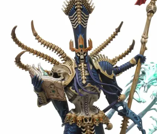
In extended analogous harmony, two additional colors are chosen from the extreme ends of the color wheel. For instance, a Genestealer miniature featuring the central color blue-violet would use red on the left and blue on the right to create an extended analogous harmony. While the tertiary colors of violet blue and red violet are the academic analogous colors, we opt for the primary (red and blue) and secondary (violet) colors to create a stronger contrast.
Triadic Harmony
Triadic harmony involves the use of three colors that are evenly spaced from each other on the color wheel, creating a triangle. One of the colors is typically dominant, while the other two are used to paint less prominent or recessive parts of the miniature. For example, an Ultramarine miniature, which is predominantly blue, could use red and yellow to create a triadic harmony. The use of non-neutral colors to decorate details in a predominantly blue miniature makes it visually appealing and creates a harmonious triad. The Ultramarine chapter uses primary colors (red, blue, and yellow) to create their triadic harmony, which is aesthetically pleasing and has contributed to their popularity.
Harmony by Split Complementary
Split Complementary harmony uses a base color and two colors that are on each side of its complementary color. For example, if the base color is green, the two complementary colors would be red and yellow. In this case, yellow and reddish-orange would be used as split complementary colors.
This harmony is often used to create smoother and more balanced contrasts than traditional complementary harmony. It is an excellent choice for those who want a more subtle and sophisticated look for their designs. An example of this harmony in Warhammer miniatures could be a color scheme for Chaos soldiers, which uses shades of dark green and yellow-green combined with reddish-brown.
Harmony by Tetrad

Tetrad harmony uses four equidistant colors on the color wheel, creating a square when connected to each other. This harmony is very useful for achieving vibrant contrast and tonal variety in a design.
For example, a Tetrad color scheme could include shades of orange, green, blue, and violet. To maintain visual balance in the design, one color should be used as the main color and the other three colors should be used to accentuate specific parts of the figure or design.
Harmony Through Temperature accpording to the color theory for miniature painting
Out of all the color harmonies described previously, harmony through temperature can be considered the most universal. This is because many of the harmonies mentioned earlier have a significant element of harmony through temperature, considering the combinations between warm and cool colors.
According to the theory of color in miniature painting, why should we first consider harmony through temperature?
This is the first harmony that we should consider because all colors can be warm or cool depending on their tone and, of course, by comparing one color to another. For example, yellow is always considered a warm color, but if we add some white to it, the comparison will make the new color a cool yellow in relation to the pure yellow.
Understanding Warm and Cool Colors

Before we dive into the concept of creating harmony through temperature, we need to understand what warm and cool colors are. Warm colors are those that remind us of the sun or fire, such as red, orange, and yellow. These colors tend to evoke feelings of warmth, energy, and excitement. On the other hand, cool colors are those that remind us of water or the sky, such as blue, green, and purple. These colors tend to evoke feelings of calmness, relaxation, and peace.
Creating Harmony Through Temperature

Now that we understand what warm and cool colors are, we can explore the concept of creating harmony through temperature. The key is to pair warm colors with other warm colors and cool colors with other cool colors. This creates a sense of balance and harmony in your design.
Using Temperature to Create Mood Temperature can also be used to create a specific mood or feeling in your design. For example, if you want to create a cozy and warm feeling, you can use warm colors such as red, orange, and yellow. On the other hand, if you want to create a calm and peaceful feeling, you can use cool colors such as blue, green, and purple.
Conclusion about Chromatic Harmony in Painting Minaitures
Choosing an appropriate color harmony is essential for creating a visually appealing and balanced color scheme. Color harmonies can be simple or complex, but it's important to have a basic understanding of how colors work and how they can be used in combination.
When applying a color harmony in painting Warhammer miniatures or other designs, it's important to remember that there is no single "correct" answer. Each color scheme is unique and depends on the artist's personal taste and vision.
The most important thing is to experiment and try different color combinations to find the one that best suits your needs. With a little practice and basic understanding of color harmonies, you can create beautiful and balanced designs that attract the attention of viewers.
")